A big, heartfelt THANK YOU to everyone who stopped by the Galerie Manualis booth at the Lausanne Art Fair last weekend! I deeply appreciated your interest in my work and hope to see you all again in the near future… most likely at the Montreux Art Gallery in November. Stay tuned for more news!
Author Archives: Steven Antalics
Review of ‘First Man’
I don’t normally post film reviews, but this film had me torn: on the one hand, it was at times a riveting account of the Apollo space program, the adventures of the men who helped land the first man on the moon, and the tragedies which befell those same brave men along the way (not to be sexist, they were mostly men).
On the other hand, the film felt schziophrenic in its portrayal of Neil Armstrong. It felt like there were two films mashed into one, and ineloquently at that. I don’t mind some family drama as the backdrop against a plot like this, but I felt it was almost 50/50 and really detracting, for a number of reasons.
Firstly, the cinematography was just atrocious. Using the jerky-cam for shots of suburban life is not only unnecessary, it’s jarring, and it has exactly the *opposite* effect of ‘drawing the viewer into the action.’ When I observe others’ lives, I am usually relatively static, and the camera, when it reflects that, makes the intimate, non-action sequences *more* realistic, not less.
Secondly, as I mentioned, the 50/50-ish weighting. What story is this? Is this about Neil Armstrong overcoming his young daughter’s death? Because, if so, the film doesn’t really make that point very well. How did this death affect his training or his ability to command missions? Was he more reckless as a result? Less? We have no idea, so what was the point?
I don’t mean to sound callous, but as my friend pointed out, *many* people have lost loved ones, even young children, to illness, but Armstrong will only ever be the first man to set foot on the moon. I understand the desire to be both accurate, to ‘humanize’ him, and to give him personal struggles/demons to overcome, but it’s disjointed. I felt this storyline was shoe-horned in (at whose behest I have no idea).
Thirdly, the entire ‘family drama’ thing was overblown and overwrought. Aside from the one outburst from Armstrong’s about speaking to their sons, it felt contrived. There was not obvious or subtle strain on the Armstrongs’ marriage, any more than any of the other couples who had devoted themselves to NASA over those years.
Lastly, while the action sequences themselves were well-shot (here the jerky-cam/steady-cam split worked very well), I was disappointed that they barely showed any of the excitement of the moon landing. Yes, Armstrong could’ve left his daughter’s bracelet, and that was poignant, but what about actions like unfurling the flag? And in all the action sequences, save for the first one, they neglected the harrowing and difficult process of re-entry.
The opening action sequence, with Armstrong skipping off the atmosphere, the training, the explosion inside the capsule that killed 3 astronauts (damn), the first successful docking and then spinning out of control, the launch of Apollo 11 – all of these were handled magnificently and carried real emotive power.
balancing act
Sometimes I wonder at the things that people get hung up on when it comes to photography. Things like “I don’t have the right equipment” (doesn’t matter!) or “I forgot my tripod” are poor excuses to making a decent photograph. Even shooting on ‘auto’ mode, most of the time just turning off the flash (which most cameras allow) will help. Here are a couple of tips that have helped me.
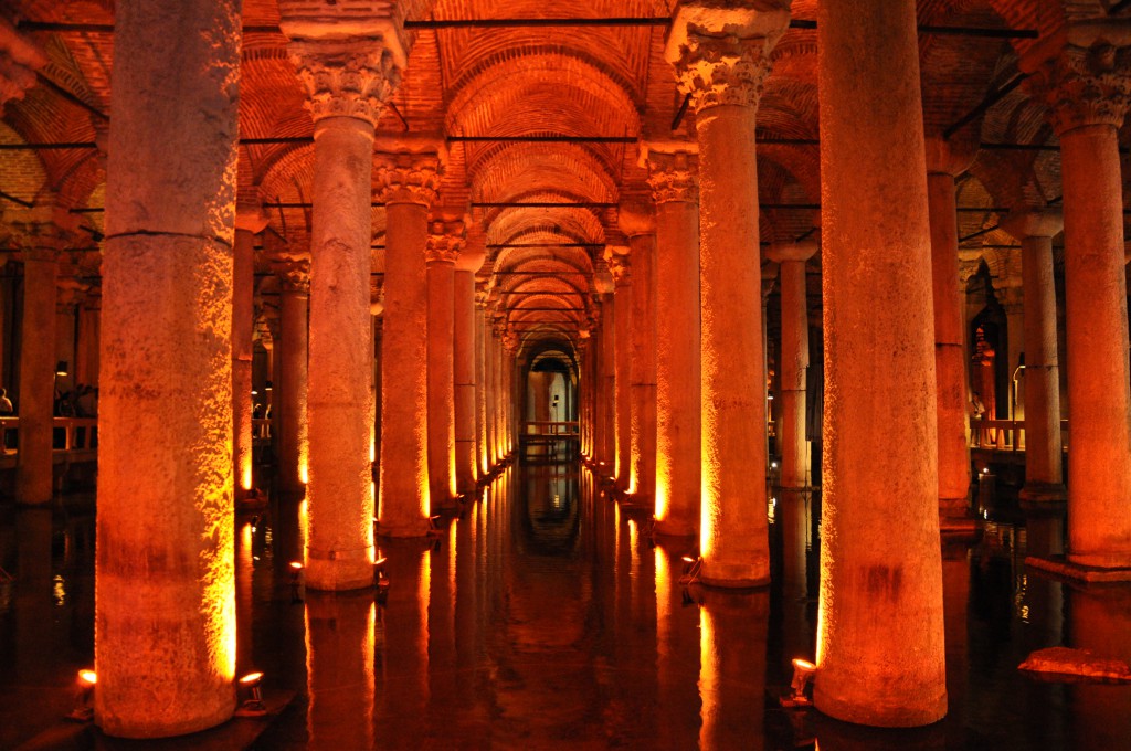
If you don’t have a super-high-quality sensor (e.g. a full-frame (FX) camera), you’re at a disadvantage in low-light situations. However, even if you don’t have a tripod, one trick is to balance you or the camera on something stable to get a good exposure. The below was taken underneath the Hagia Sophia in Istanbul. I had a Nikon D90 at the time, and while it’s a pretty decent camera in most low-light situations, there just wasn’t enough light to make a decent exposure. Therefore, I balance the camera on one of the handrails to get a decent photo:
There are a couple other tips to keep in mind for balancing the camera, and not just for low-light situations. Even shooting in daylight, sometimes it’s hard to get a clean shot off – especially when capturing moving subjects. You can always lean against a doorway or building or signpost or something to help stabilize your camera. Also, most of the ‘camera shake’ actually occurs in the lens, so make sure you support the lens of the camera too. In addition to tripods, you can also use other things to attach the camera to a stable surface. You can also use bean-bags or your camera bag as a ‘shock-absorber’ to reduce the amount of muscle movements that make it into your frame. Finally, in low-light especially, it pays to pre-focus the camera (if you’re shooting moving subjects it’s almost mandatory in these situations) because you’ll lose a lot of time with most cameras “hunting” for focal points in the low light. A related point (which I’ll cover in my next post) that can help is if you learn how to shoot manually with your camera – auto is NOT always the best option for low-light photography!
What are some of your tips for steadying your equipment? Leave your tips in the comments, and they’ll be duly ignored! ;-)
backlit clouds
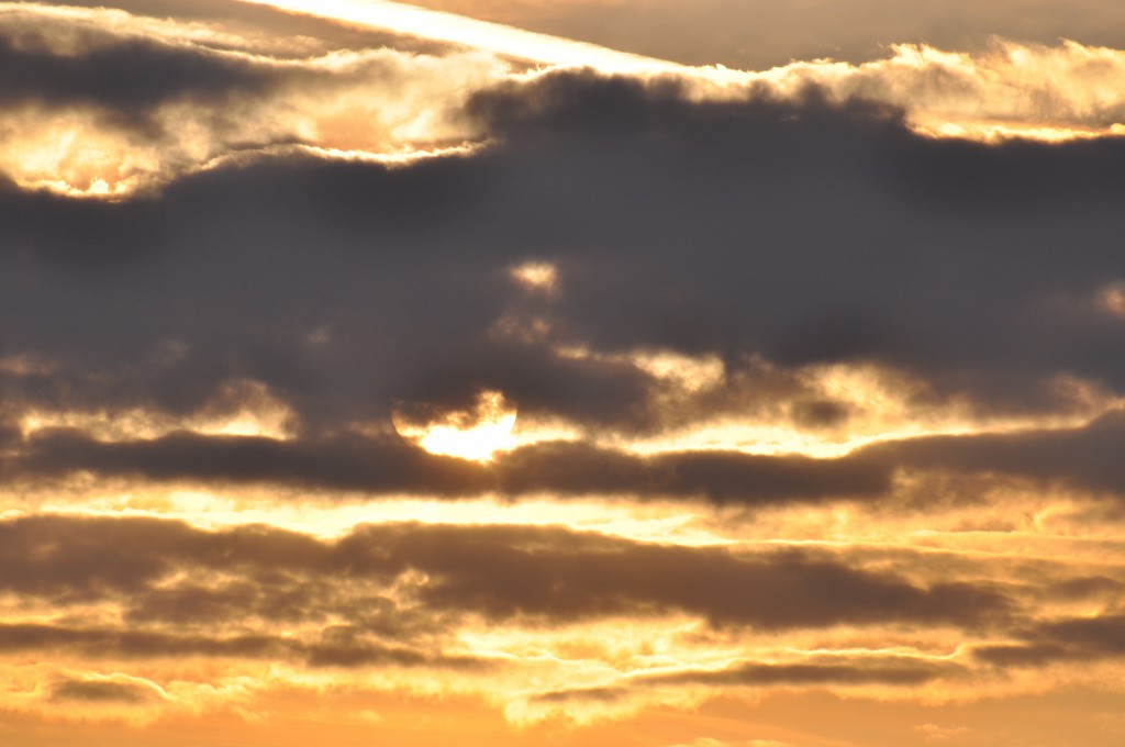
I’m not entirely certain why, but my eye is often drawn to clouds when they’re backlit by either the sun or (preferably) the moon. I like the post-apocalyptic color palette in the below shot, and how grimy the clouds look (and other than a small tweak of the levels, I haven’t done any post-production on this photo).
spooky trees
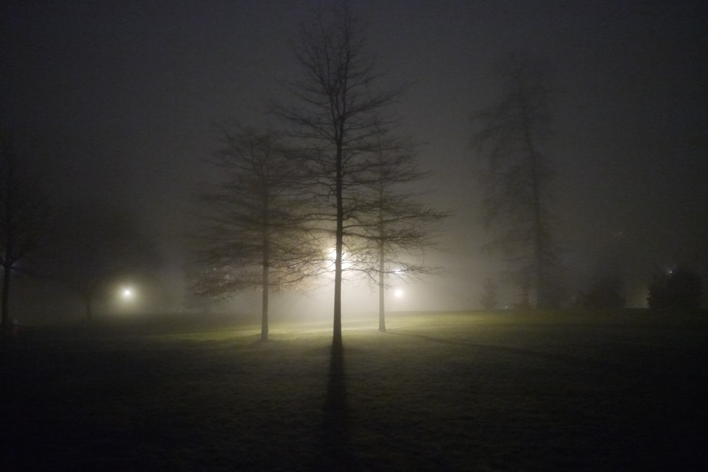
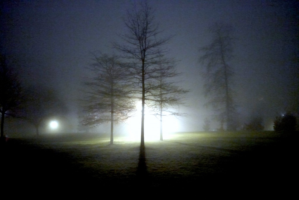
This was taken as I was walking to my parking garage. There’s a nice park just across the street, but even the quaintest scenes can be transformed by the light – especially when combined with fog. It’s reminiscent of the atmosphere of “Close Encounters of the Third Kind.”
Also, just check out the effect of some minor tweaks to exposure/levels, contrast, and tone can achieve (and when I say minor, I mean less than a couple minutes of effort). Now it looks like a UFO landing photo – with another one following hot on its trail! INVASION! Head for the hills!
the difficulties of architecture
I tend to take a lot of pictures of static things. I think architecture (buildings‚ monuments‚ etc.) poses a particular challenge for the amateur. For starters‚ we often have limited access to most buildings (unless you are an “urban explorer” or one of those nucking futs dudes who scale skyscrapers)‚ and that automatically limits most of our photos to the exterior. Another consideration is the fact that so many other people have likely taken pictures of the most-interesting façades that it’s hard to get a unique interpretation.
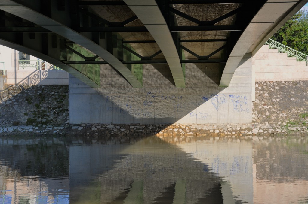
Below is a shot of the underside of a bridge in Hungary that I noticed when sorting photos in my archives. I think it was Ken Rockwell who mentioned the tip that a good/well-composed photograph is evident even at thumbnail size (near the end of “The Basics” section of that link)‚ and there was something about the way the light played into that X shape you see underneath the bridge that caught my eye. The crux of the X is almost perfectly centered (yay!)‚ though I had to tamp the highlights down a bit‚ as the original was slightly over-exposed (this was shot on my old D90‚ a great camera‚ but before I was comfortable with manual controls). What I also like about the shadow-X is that it’s also being replicated by the stairs on the right and the shadow of the bridge’s railing on the left.
I also like the textures of all the rocks‚ the underside of the (relatively new) bridge‚ and the reflections the nearly-smooth water. The quality of the light and the exposure could’ve both been better – maybe I’ll try to re-shoot this during the Golden Hour. Overall‚ I think this is an example of a picture with a lot of compositional strength‚ but it’s just not all that attention-grabbing in the end‚ at least not for me. If this were a contest‚ I’d rate it an ‘honorable mention’ or something similar. :)
Emily Dickinson’s “This Dust … “
So since I’m interested in both photography and writing, I thought I’d do some bits of literary analysis too. I may be making too much of the “bloom,” but don’t let me tell you – let me know if you think it’s overmuch!
As part of a course at university, I taught poetry to high-schoolers. This was one short poem that I helped deconstruct for them. The part before the line break was what I taught them in class; I then encouraged them to analyze the rest of the piece on their own.
This quiet dust was gentlemen and ladies
And lads and girls;
Was laughter and ability and sighing,
And frocks and curls;This passive place a summer’s nimble mansion,
Where bloom and bees
Fulfilled their oriental circuit,
Then ceased like these.
So, as with most of Dickinson’s work, the poem is quite short. Unlike some other shorter styles, such as haiku or tanka, the poem is not only descriptively evocative (“frocks and curls”), but also touches directly (rather than obliquely) on larger themes of love, loss, and the “circle of life.”
What I found most arresting was the reversal of the typical “ladies and gentlemen.” What this does is immediately slow down your eye, which tends to skim familiar phrases, without revreting to any special tricks ;-) This slowing down also harkens back to the “quiet” dust (not being quickly swept away or whirling in a breeze), which can also be seen as an allusion to both death – the ultimate silence – and Shakespeare, whose ‘Macbeth’ mentions “dusty death” in his famous soliloquy (n.b., probably the best brief monologue in English). The mention of people juxtaposed against dust/death is not such a stark contrast when you consider that many people believe(d) dust to be primarily composed of human skin cells (which is actually not the case). Regardless, the dust can also be seen as a stand-in for ash, echoing the Catholic “ash to ash, dust to dust” refrain. Or, if you want to be hopeful, stardust, but since this was the 1860’s and not the 1960’s, we’ll stick to the former interpretation. ;-)
All of the above in one line, with a very dense sense of time and space, which the second line then expands greatly upon with the deceptively-simple “And lads and girls;” Here, the structure is the same as the “gentlemen and ladies,” which does two things. Firstly, it reinforces that reverse-order view, but in a more subtle way, which keeps the reader still every-so-slightly off-balanced. However, secondly, and more importantly, the second line now brings in the weighty theme of time, and it does so in two ways. Firstly, the simple mention of the colloquial “lads and girls” immediately brings to mind all childhoods and times of greater innocence. Secondly, and more subtly, the fact that the reverse-order remains reinforces also that the effects of time, and our inevitable march towards dust/death, are the same for everyone, male or female, young or old.
It’s a very casual manner of approaching a very weighty theme, a style that is continued in the subsequent two lines, which mention “laughter,” “singing,” “frocks,” and “curls.” Nothing serious, just the halcyon images of any childhood or loving family, images which set us up for the turn in the second stanza.
As with much of Dickinson’s work, the “turn” here comes with the line break into the final stanza. The language immediately signals a change of both focus and tone, the alliterative “passive place” is quite a hefty phrase, given what came before. You also have much greater specificity with this instance of “this.” In its first use, “this” dust is general in the sense that it applies to all people, and none of the nouns refer to specific people or places; in the second use of “this,” we have a mention of a “passive place,” (personification) as well as “summer’s nimble mansion” – far more specific descriptions than any preceding this line. “Nimble” also contrasts lightly with the “quiet” of the dust, though the place remains what I interpret to be a (passive) recipient of dust – not necessarily its bustling originator.
“Where bloom and bees” is an interesting turn of phrase. One could take “bloom” to refer to all the flowers that bloom, though “blooms” could also be seen as more appropriate, assuming there are multiple types of flowers in the garden (with different periods of blooming). Not being a linguistics expert, I don’t know if “bloom” has changed shades of meaning/usage through the years, but I will take it as referring to the general bloom of the flowers (like an algal bloom). So it’s interesting that bloom remains singular, but bees is plural. So “the bloom and the bees” “fulfilled their Oriental circuit” – a phrase that’s strikingly similar to “the birds and the bees.” Of course, Oriental had quite a different connotation then, and is rarely used now, so I won’t dwell on it too much, except to note that flowers “orient” themselves towards the source of light, so it’s a well-chosen term in this context.
The final line brings the final somber turn, and quite a bit of ambiguity for a Dickinson poem to end on. Firstly, there is a juxtaposition between the idea of a circuit, calling to mind the unceasing rotations of the Earth around the Sun, with the morbid tone of the final line. Secondly, “these” what? Circuitously, the final “these” appears to refer back to the initial “dust,” though I am not sure that “these dust” is (or was) grammatically correct. It’s an intriguingly ambiguous note on which to end, but it does draw in the final grand sweep of everything the poem has directly mentioned or implied. It’s definitely an ending chosen by a mature, confident writer, for whom there is more than a little bit of teasing in ending on a rhyme that sticks in your mind and leaves you wanting just a bit more …
Savigno Wedding
So while I intend to keep the galleries relatively static, only occasionally updating them with new work, I thought in this Web 2.0/social media online landscape it would be good to have some content that’s always updating to act as both a prompt for me to display other photos I’ve taken and a way for you to interact with me through the comments. So I’ll post a new picture approximately every week, either new or from “the archives” lol, and I’ll explain a bit about the shot: why I think it works (or doesn’t), why/where I took it, etc.
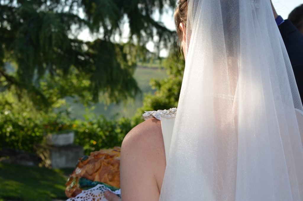
To kick things off, I was in a wedding in Savigno this weekend. I took this shot of the bride as she was carrying around a large loaf of decorated bread (part of a Ukranian tradition where you break pieces of the load off and dip them in sea salt before eating them). The shot is from behind, so it breaks the “rule” that you should always include the eyes when shooting a portrait, but I still think it works in terms of how it’s framed: the composition is broadly in line with the rule of thirds, and even though you cannot see her eyes, you can tell the general direction in which she’s looking, which leads your eye into the empty space in the frame. And who can resist the beauty of the warm Italian light filtering through her veil?
So overall I think the shot works for me, but what do you think?
